Learn your wayFlexible on-demand lessons
Apply your skillsReal-world frameworks
Track your growthA clear learning journey
Expert-led learning designed to turn insight into action. Switch between desktop and mobile, examine the structure, and replay the reveal animations. Scroll inside the design to explore the full page.
Expert-led learning designed to turn insight into action.
Explore Courses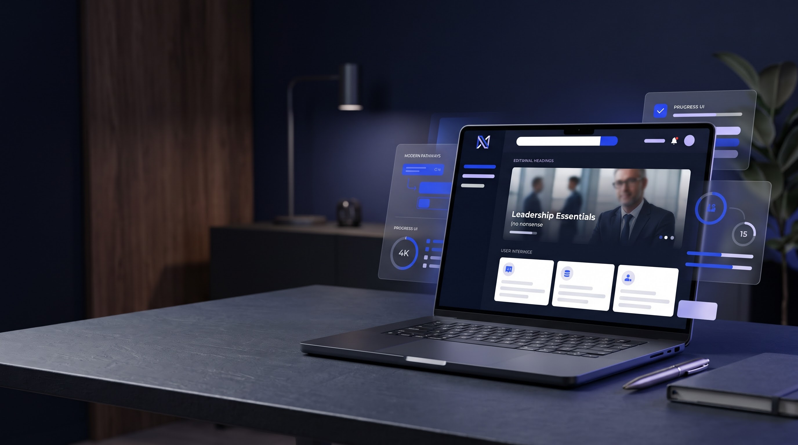
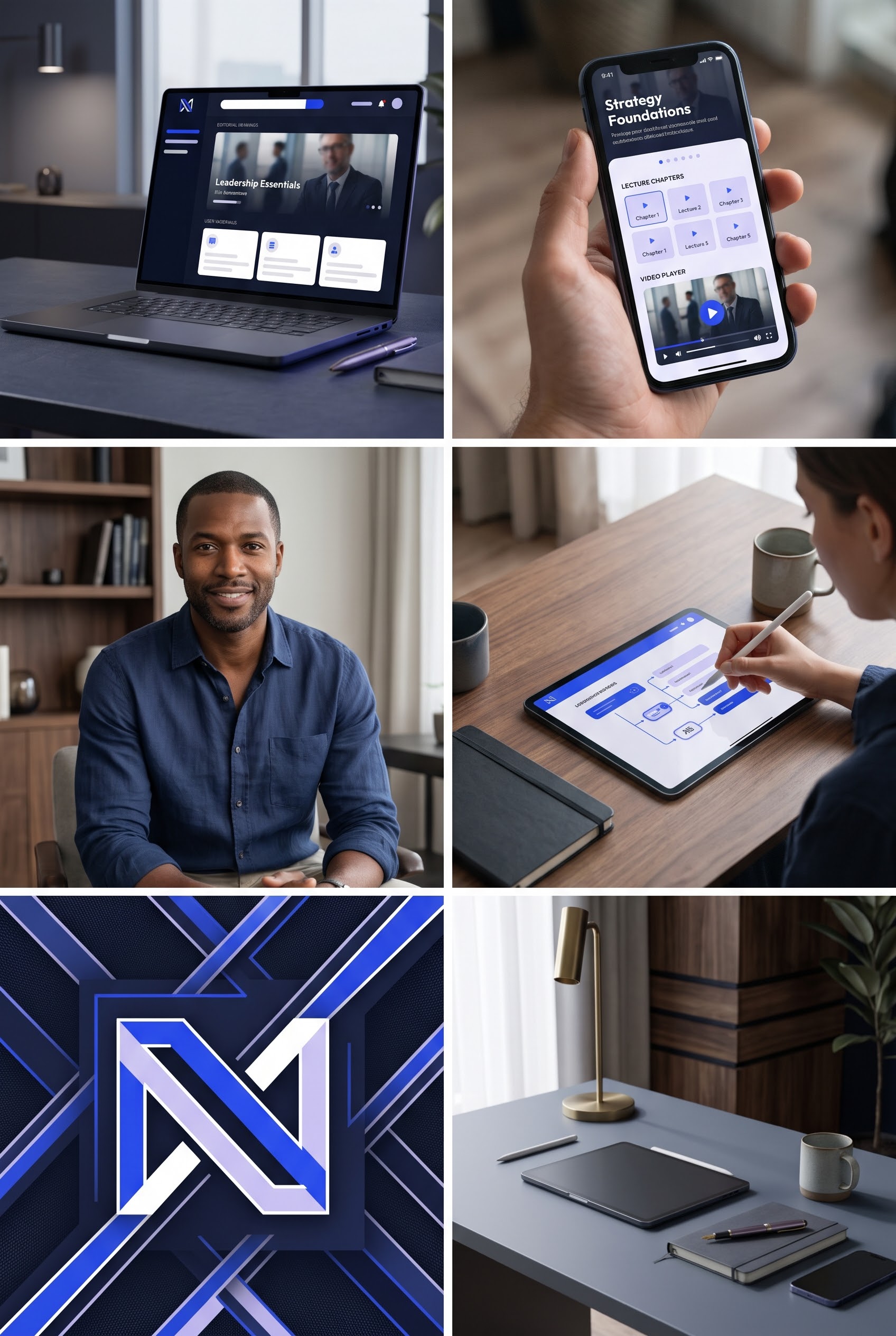
Learn in focused chapters, explore real frameworks, and turn knowledge into practical momentum.
Discover MoreThis is a creative demonstration. Replace this section with your real booking, shop, or contact workflow before publishing as a client site.
Explore the StoryOriginal supplied brand identity, campaign photography, and moodboard are included in this download.
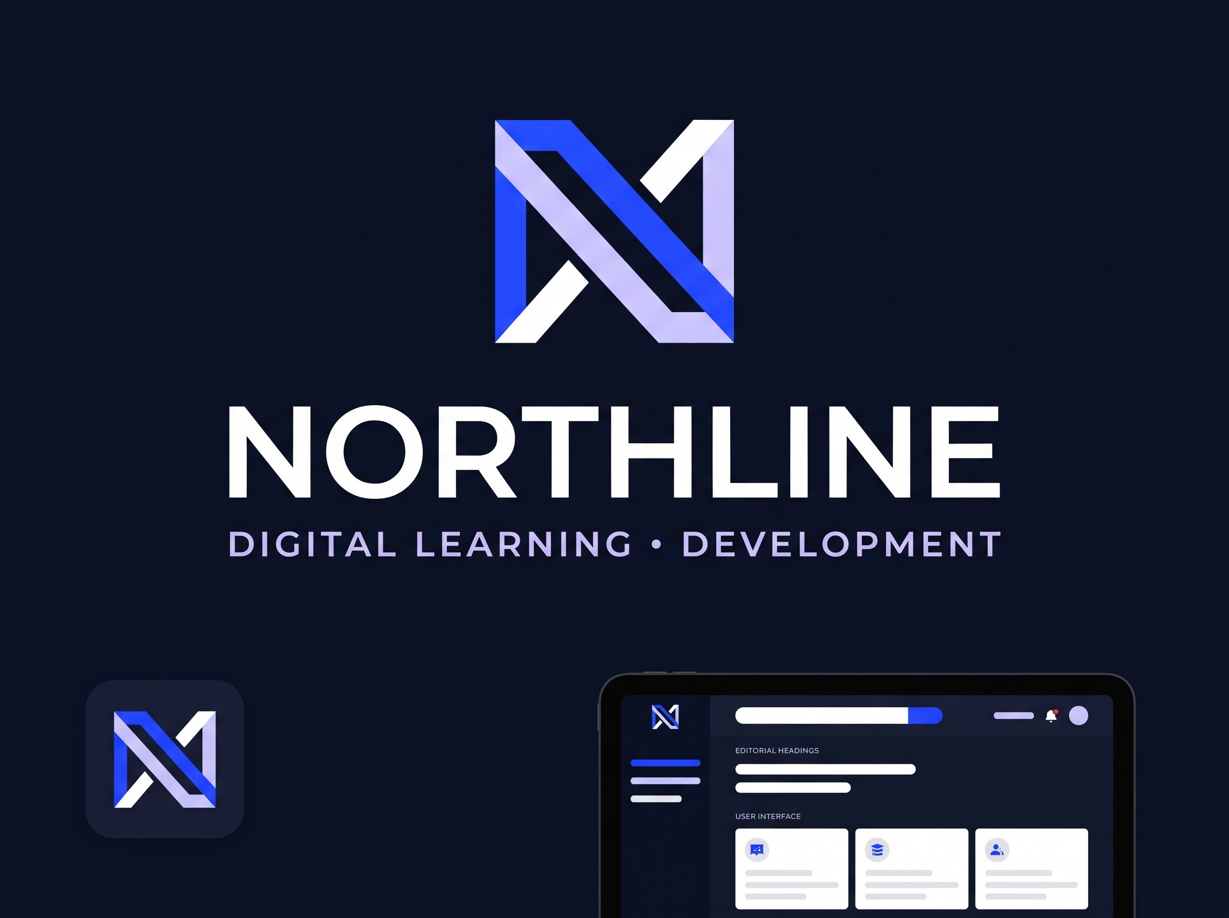
Colors: #10182f · #f2f3fa · #355bff
A reusable design prompt for applying this visual language to an existing client project.
Apply this visual style to the user's existing project. Preserve its framework, routes, copy, working behavior and accessibility. Do not rebuild unrelated parts of the application.

DESIGN DIRECTION: The Product Stage — NORTHLINE. Digital Learning & Development.

VISUAL IDENTITY: primary #10182f, background #f2f3fa, accent #355bff. Use deliberate typography, precise editorial spacing, custom art direction, and the supplied brand photography. Never replace original logos or portraits with generic placeholders.

HERO: Strong product-led split hero with a prominent laptop/dashboard showcase, dark navy environment, electric blue actions, and layered interface depth.

PAGE JOURNEY: Brand introduction; three focused proof/value statements; editorial story section; clear conversion close. Include meaningful secondary content, not generic filler.

MOTION: Subtle staggered typography reveals, image entrances, hover feedback, and restrained scroll transitions. Respect prefers-reduced-motion.

RESPONSIVE: On mobile, preserve composition and legibility, use a compact navigation, and avoid covering any faces. Controls must remain keyboard-accessible with visible focus.

BUTTONS: Plain text labels. Never append decorative arrow icons.

QUALITY BAR: Original, high-end agency design. No developer labels on branded pages, no fake testimonials or metrics, no broken links, no empty interactive controls. Verify actual desktop and mobile layouts.